 Pure Data Party Publisher
List of available overrides
The system of override is a way to customize a gui component from pd and transform it into something else. You can just override the graphics, or you can re-code the behavior. We have built a few overrides as ‘out of the box’ features to customise your apps.
You can use those features by configuring them in the launcher,
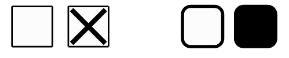
FilledToggle
The FilledToggle is a graphic override. It replaces the basic toggle from pd, to a rounded rectangle, no more cross when active, instead the rectangle is filled.
To use it you need to import those classes to your launcher :
import net.mgsx.ppp.widget.core.Toggle;
import net.mgsx.ppp.widget.custom.FilledToggle;
If you want to override all components in your gui you can do it by adding this line of code to your launcher :
config.typeOverrides.put(Toggle.class, FilledToggle.class);If you want to override only the toggle labelled ‘tgl’, this line :
config.objectOverrides.put("tgl", FilledToggle.class);PopupTaplist
The PopupTaplist is a behavior override.
The comportement aspect, is advanced, as it uses android layout to display a browsable list of elements, you just have to click to select the new value.
To use it you need to import those classes to your launcher :
import net.mgsx.ppp.widget.abs.Taplist;
import net.mgsx.ppp.widget.custom.PopupTaplist;
If you want to override all components in your gui you can do it by adding this line of code to your launcher :
config.typeOverrides.put(Taplist.class, PopupTaplist.class);If you want to override only the toggle labelled ‘taplist’, this line :
config.objectOverrides.put("taplist", PopupTaplist.class);RibbonSlider
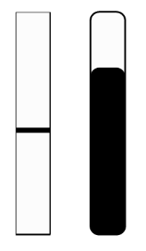
The RibbonSlider is a graphic override. The slider now has nice rounded angles, and the level selected is clearly represented as filled rectangle, instead of just a simple line. It applies to vertical and horizontal sliders.
To use it you need to import those classes to your launcher :
import net.mgsx.ppp.widget.core.Slider;
import net.mgsx.ppp.widget.custom.RibbonSlider;
If you want to override all components in your gui you can do it by adding this line of code to your launcher :
config.typeOverrides.put(Slider.class, RibbonSlider.class);If you want to override only the toggle labelled ‘vsl’, this line :
config.objectOverrides.put("vsl", RibbonSlider.class);SimpleBang
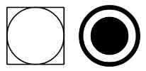
The SimpleBang is a graphic override. No more rectangle framing the circle, it’s now nice and round with a thick edge.
To use it you need to import those classes to your launcher :
import net.mgsx.ppp.widget.core.Bang;
import net.mgsx.ppp.widget.custom.SimpleBang;
If you want to override all components in your gui you can do it by adding this line of code to your launcher :
config.typeOverrides.put(Bang.class, SimpleBang.class);If you want to override only the toggle labelled ‘bang’, this line :
config.objectOverrides.put("bang", SimpleBang.class);SimpleRadio
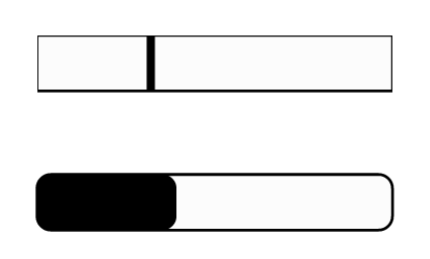
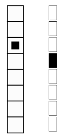
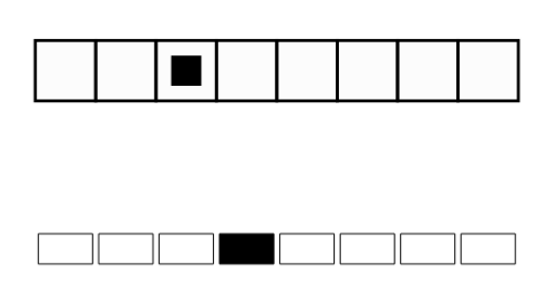
The SimpleRadio is a graphic override. The index of the radio is now marked with a filled rectangle, and buttons are separated. The displayed widget is half the height of its pd implementation, this way if you put a label, with the top part of your font aligned to the top line of the radio, the label is just above it. As for the slider override it applies regardless of the widget orientation.
To use it you need to import those classes to your launcher :
import net.mgsx.ppp.widget.core.Radio;
import net.mgsx.ppp.widget.custom.SimpleRadio;
If you want to override all components in your gui you can do it by adding this line of code to your launcher :
config.typeOverrides.put(Radio.class, SimpleRadio.class);If you want to override only the toggle labelled ‘hradio’, this line :
config.objectOverrides.put("hradio", SimpleRadio.class);SwitchToggle
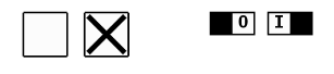
The SwitchToglle is a graphic and a behavior override. As its name state your toggle will now look like a switch. As for the radio, the height will be half the one of the classic version.
It will also act like a switch : slide right to activate it, and slide left to de-activate. It’s probably a good place to look first if you want to write your own overrides.
To use it you need to import those classes to your launcher :
import net.mgsx.ppp.widget.core.Toggle;
import net.mgsx.ppp.widget.custom.SwitchToggle;
If you want to override all components in your gui you can do it by adding this line of code to your launcher :
config.typeOverrides.put(Toggle.class, SwitchToggle.class);If you want to override only the toggle labelled ‘stgl’, this line :
config.objectOverrides.put("stgl", SwitchToggle.class);